Waterfront Design: Lessons from Denmark

< Inventive activators: Harbor swimming dock >
Thanks to a generous grant from the Scan|Design Foundation I’ve had the privilege of spending the last two months in Denmark. It was an excellent opportunity to examine, in detail, successful waterfront redevelopment in Copenhagen and elsewhere. The Danes have a well earned reputation for creating high quality, inviting and lively waterfronts—and even their mistakes (which aren’t many) can be informative.
Cities around the world are transforming industrial and utilitarian harborfronts into great places for people. As Seattle embarks on its own waterfront transformation this is an opportune time to explore these global solutions. Here are five lessons from Denmark:

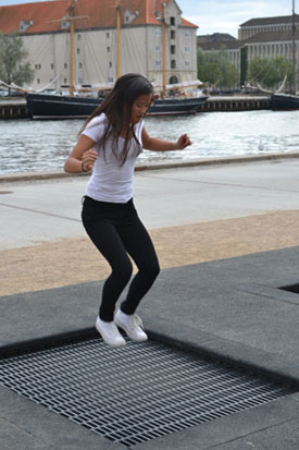
< Public Trampoline >
Lesson One ACTIVATE ACTIVATE ACTIVATE
The best public spaces offer a range of attractions from passive to active, high brow to low. Seattleites have a long running aversion to mixing our public spaces with commercial uses, but it may be time to reconsider. In Copenhagen outdoor cafes, food kiosks and other vendors add vitality and interest–animating public spaces around the clock and throughout the year.
Lesson Two AARHUS–A CAUTIONARY TALE
Today, the Alaskan Way Viaduct is such a huge, loud and unpleasant presence it is difficult to imagine what our waterfront will be without it. All we can easily envision is that it will be better. But a generation from now few will remember the viaduct and its noxiousness, and our waterfront will have to stand on its own merit. To get a better feel for what that will be like, it is worth examining Aarhus, Denmark’s second largest city. Today central Aarhus is separated from its waterfront by a surprisingly noisy, heavily trafficked, five lane arterial.
This is a very similar condition to the proposed post-viaduct Alaskan Way, which at 66 feet wide and with an expected 30,000 vehicles a day, will be one of the widest and busiest streets in Seattle’s center city.
To avoid replacing one barrier to our waterfront with another we must design superior pedestrian connections across Alaskan Way—with elements such as wide crosswalks, long pedestrian crossing phases and high quality pedestrian amenities.
Lesson Three QUALITY OVER QUANITITY
Given the huge opportunity to transform Seattle’s central waterfront there is a natural desire to do everything at once. Some elements like the rebuilt sea wall and new Alaskan Way will obviously need to be constructed in one phase, but the Danes show that high quality materials and fine grain design gestures are the key to successful places. If resources are limited, slow implementation beats the quick and expedient.
Lesson Four BE TRUE TO PLACE
What makes places memorable–and likely to pass the test of time–are those that are unique and genuine. An excellent example is Copenhagen’s new national playhouse designed by Lundgaard & Tranberg. The structure is supported by massive upper level trusses that not only reduce the need for interior columns but also serve as a potent allegory to the earlier shipping cranes that once lined Copenhagen’s industrial harbor. Rather than facing the street, the building further responds to its maritime context by orienting its entrance, lobby (and outdoor café) to the harborfront.

< Danish National Playhouse >
Lesson Five BEWARE THE PHOTOSHOP SWINDLE
Copenhagen based Gehl Architects, an international authority on creating successful public spaces, warns against those designers whose illustrations promise public space filled with mobs of happy users when in reality the spaces end up lifeless and deserted. The most successful spaces invite you in–and entice you to stay–with a broad range of real and well thought out activities.
The removal of the Alaskan Way Viaduct gives Seattle the rare opportunity to transform our waterfront. Drawing lessons from elsewhere will guarantee our success.
>>>
Lyle Bicknell is principal urban designer at the City of Seattle’s Department of Planning and Development. He recently returned from a two month sabbatical in Denmark sponsored the Scan|Design foundation.
Â

