B(L)ANKS

The design and treatment of the lower floors of buildings have a decisive influence on the life of an urban space. This is something we feel intuitively as we walk along a well-designed block with a variety of uses and plenty of visual interest. To paraphrase the preeminent urban designer Jan Ghel, building frontages are the city’s edge zones that you see closely and experience intensely and where buildings meet and mix with the city. If the ground floors of buildings are designed in porous, transparent and interesting ways, the simple experience of walking down a city street can be energizing.
Accordingly, there are strong reasons for city policy to promote active and interesting ground floors, particularly in our neighborhood centers. Seattle recognizes this in its Design Review Program, which reviews the architecture and design of new developments throughout the city. One of the key Design Review guidelines is the pedestrian environment, which states that “buildings should avoid large blank walls facing the street, especially near sidewalks.â€

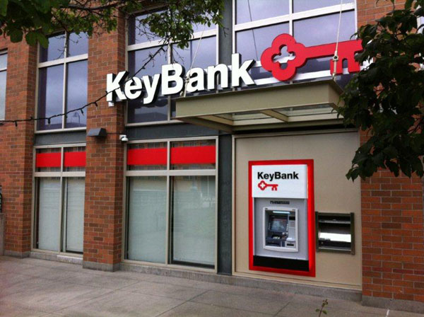
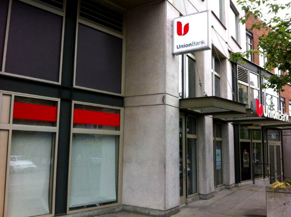
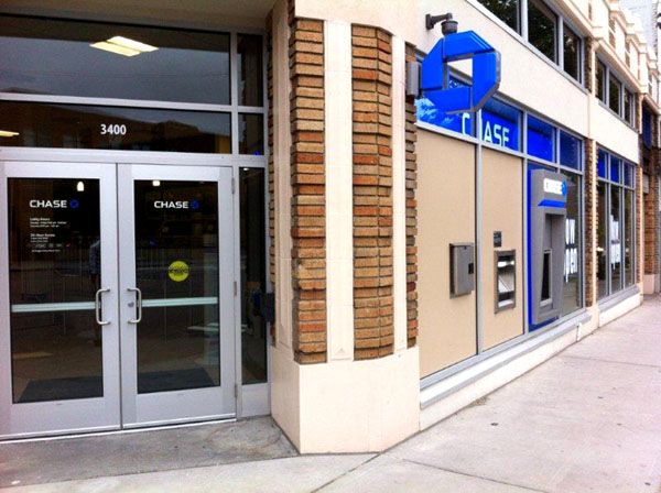
Though this objective is often met in the development and construction of new buildings, in the actual operation and tenanting of buildings it is occasionally severely lacking. This is no more evident than in the recent wave of bank branch openings in Seattle’s neighborhood centers, many of which are deliberately designed to have large blank facades that make for an unattractive and uninteresting streetscape. I’ve come to think of these new spaces as b(l)anks.
A b(l)ank is a bank branch in a prominent location that is deliberately designed and operated to function more as a billboard than a part of the commercial community of the neighborhood, with large ATM walls and street facing windows obscured by blinds or ads. A prime example of this is at the corner of Fremont Avenue and 34th Street in the heart of the city’s iconic Fremont, where three bank branches now define what should be a lively and interesting intersection.

Given how much time and effort goes into designing, reviewing and constructing buildings to promote transparent and interesting storefronts, it is unfortunate that poor tenant selection can negate much of the benefit of good design and end up being detrimental to the streetscape and consequently the care and commitment people have to their shared space. Having banks in our urban centers is of course quite useful, and building owners are obviously attracted to the income and credit that come with bank tenants. But one can only hope that many building owners and banks will begin to recognize that in an era in which walkable urbanity is increasingly prized, tenanting buildings with uninteresting uses that deliberately create blank facades and turn their backs on the street may be bad business in the long run.
>>>
Gabriel Grant is Vice President at HAL Real Estate Investments and is currently an Affiliate Fellow of the UW’s Runstad Center for Real Estate. All photos by the author.

